NOW
An Information Architecture study of NOW, a video-on-demand platform.
About
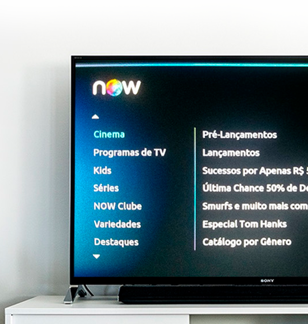
NOW is a video-on-demand service available for users of the Net and Claro cable TV subscribers. The available content includes movies and series, documentaries, and more, which can be paid or free depending on the subscription plan. The service, originally developed for cable TV, can now be accessed through a decoder, mobile application (Android and iOS), or browser.
The system evaluated in this study is the version available for customers of the Net cable operator, used for streaming on TV sets.
Goal
Contribute to improving the system usability, such that their users can find the desired content more easily and effortless.
Role
This was the final project of my post-grad, specialization course on Usability and Information Architecture.
How does content organization in a video-on-demand system affect its usability?
A video-on-demand platform hosts large volumes of several types of content, which are constantly updated with addition and removal of items to their collections. The large amount and the dynamics of the information about the collections can be overwhelming and, consequently, make it difficult for their users to find the content in which they are interested.
Therefore, the information must be organized in a user-oriented, customized way that will make it easier for viewers to rapidly and easily find the content that best fits their interests.

Online Questionnaire
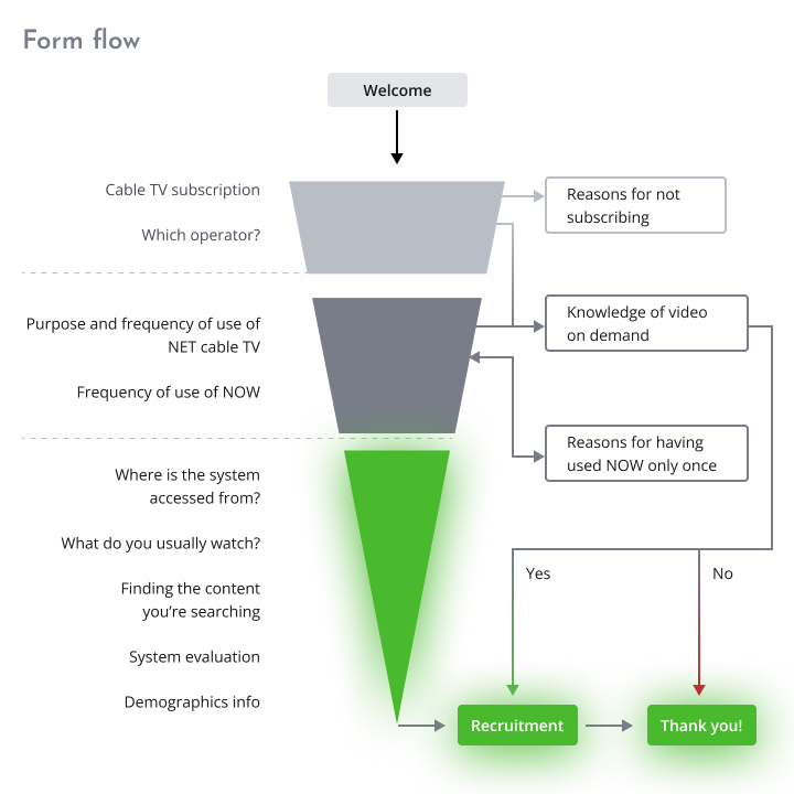
My first step was to conduct an online survey with users of the platform. I found that an online questionnaire would be easy for participants to respond and allow me to reach a larger number of users. My goal with the survey was to:
-
person_search
Find users
-
psychology_alt
Learn about their habits and behavior towards the platform
-
3p
Recruit participants for the next steps
The online form was designed to cover three levels of participants: any respondent, customers of Net cable TV, and users of the NOW service. This structure allowed me to classify the respondents and recruit, even the ones that subscribe to video-on-demand from other cable TV operators, to the next steps of the study.
Cooperative Evaluation
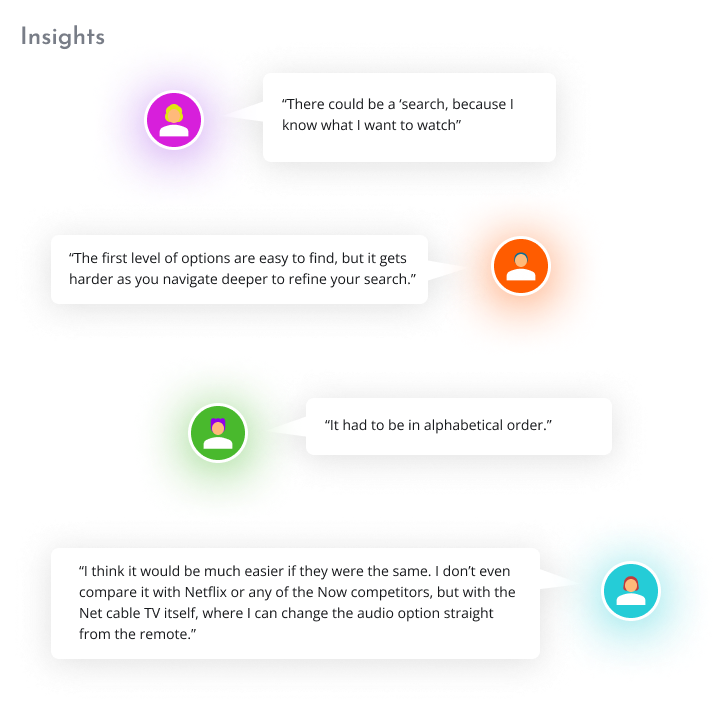
This is a technique useful to review and improve a user interface by detecting potential usability problems in a prototype or partial simulation. I relied on this technique to explore, with NOW users, changes to the system’s user interface that would improve its usability. Based on my own perspective about the potential issues that could be affecting the system’s usability, I created tasks for the users so I could:
-
visibility
Observe how users use the system
-
edit_note
Identify usability problems related to the platform’s information architecture
-
move_down
Propose improvements that would avoid the problems identified
Card Sorting
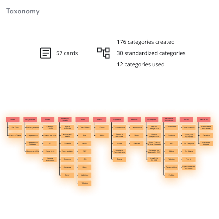
After observing how users interact with the system I needed to understand what they think about the content organization and, based on their perspective, propose a new taxonomy.
Some users were invited to reorganize the items of the main categories, as well as their sub-items up to two hierarchical levels below. Each category and sub-category item was represented as a card, which users were free to reorganize by grouping and naming them, as well as adding or removing cards.
Analysis and Enhancements
One video on demand system houses several types os content in large quantities, in addition to being frequently updated with entries and exists of content from its collection. This amount of information can overwhelm the user and consequently not find it easily.
It is necessary that information is organized in an ease way and according to what usersd have in mind.
Sorting
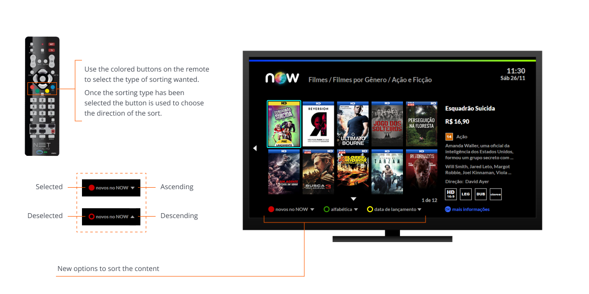
List of Action and Fiction films within the Films by Genre category. One of the proposed improvements was to offer options to sort the available content according to the user’s preferences, which will streamline search and selection.
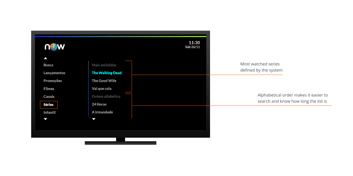
The Series category was originally presented as a list on the main page. I took advantage of this structure to break it into two parts, one with the Most Watched series and one with all series listed in Alphabetical Order.
Audio and Subtitles
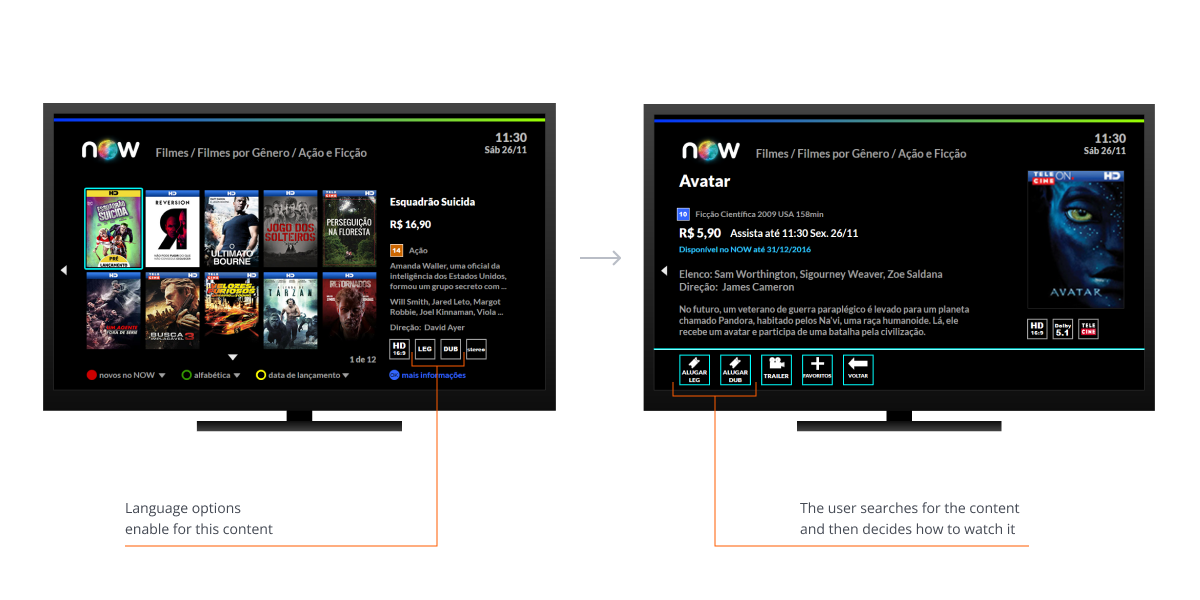
The system currently offers two options to listen to a content: audio in Portuguese, or the original audio with Portuguese subtitles. The two modes are presented to the user as independent contents. In my proposed, new interface the two modes are merged, for the user’s perspective, into a single item of content, even though they are still stored in the database as separate items.
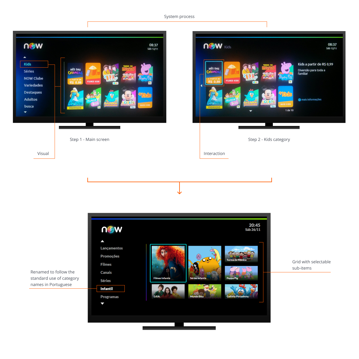
Kids category
For the Kids category, while the user can see (on the right panel) what the sub-items of the category are, they can only select a sub-item after selecting (clicking) the category and waiting for the next screen to be loaded.
I cut one step and streamlined this process with a grid that is immediately available with sub-items from the Kids category as the user navigates the main menu. The user can then select a sub-item directly from the grid.
Talk to me!
Thank you for taking the time to visit my portfolio!
Feel free to get in touch if you would like to discuss a project, a job opportunity, or share feedback on my portfolio.
